Lecture Week 6 Fri 11/8#
Binary Classification with logistic regression#
In general, for classification problems, we have data (\(\mathbf{x}_i\), \(y_i\)) for i = 1, 2, …, N, where \(\mathbf{x}_i\in\mathbb{R}^p\) is the input/feature and \(y_i\) is the output/label, which indicates the class of the input.
In binary classification, the data is divided into class 1 and class 2:
y = 1 means the input belongs to class 1.
y = 0 means the input does not belong to class 1, i.e., it belongs to class 2.
Model#
We assume the the probability of the input \(\mathbf{x}\) belonging to class 1 is
where \(\sigma\) is the sigmoid function, \(\beta_0, \beta_1, \beta_2, ..., \beta_p\) are the parameters of the model, and \(x_1, x_2, ..., x_p\) are the features of the input.
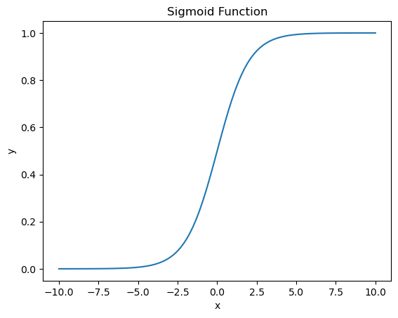
The sigmoid function is defined as: $\(\sigma(z) = \frac{1}{1 + e^{-z}}\)$ which maps any real number to the range (0, 1).
Using vector notation, we can write the model as:
where \(\mathbf{\beta} = [\beta_0, \beta_1, \beta_2, ..., \beta_p]\) and \(\mathbf{x} = [1, x_1, x_2, ..., x_p]\).
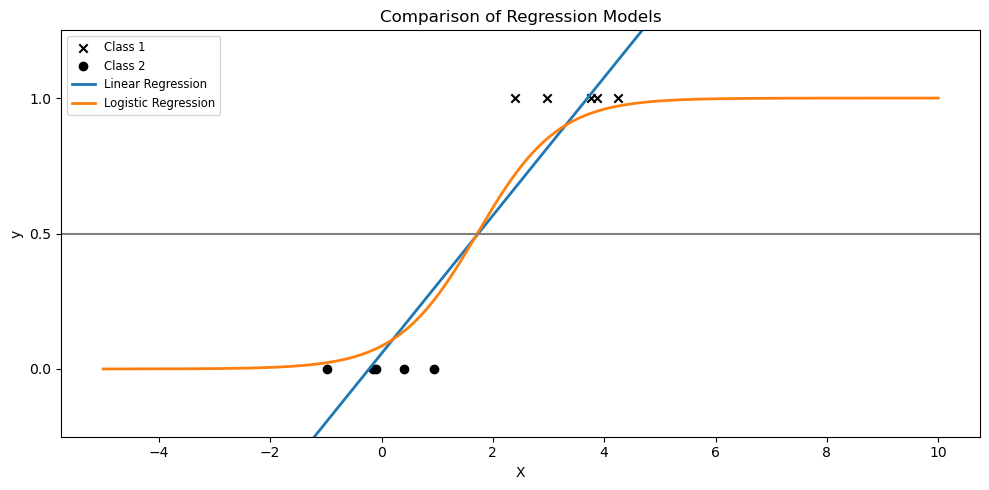
We can interpret the output of the model as the probability of the input belonging to class 1. If the output is greater than 0.5, we predict class 1, otherwise we predict class 0.
# visualizing the sigmoid function
import numpy as np
import matplotlib.pyplot as plt

def sigmoid(x):
    return 1 / (1 + np.exp(-x))

x = np.linspace(-10, 10, 100)
y = sigmoid(x)

plt.plot(x, y)
plt.title('Sigmoid Function')
plt.xlabel('x')
plt.ylabel('y')
Text(0, 0.5, 'y')
Binary Cross-Entropy Loss#
For binary classification, we will use the binary cross-entropy.
Let \(\hat{y} = f(x)\) be the predicted probability that the input \(\mathbf{x}\) belonging to class 1.
where \(y\) is the true label, which is either 0 or 1, and \(\hat{y}\) is the predicted probability, which is in the range (0, 1).
Poll: what happens to the BCE loss if the true label is 1, but we predict 0% probability of class 1?#
Alternatively, we can write the loss function as:
Let’s visualize the loss function for \(y = 1\) and \(y = 0\), and compare the cross-entropy loss function with the mean squared error loss function.
import numpy as np
import matplotlib.pyplot as plt


# Predicted probabilities from 0 to 1
p = np.linspace(0.01, 0.99, 100)  # Avoiding the exact 0 and 1 to prevent log(0)

# Calculating Mean Squared Error (MSE) Loss
mse_loss = lambda p, y_true: (p - y_true) ** 2

# Calculating Cross-Entropy (Logistic) Loss
cross_entropy_loss = lambda p, y_true: -y_true * np.log(p) - (1 - y_true) * np.log(1 - p)

# Plotting the losses for y_true = 1 and y_true = 0
fig, ax = plt.subplots(1, 2, figsize=(12, 6))
ax[0].plot(p, mse_loss(p, 1), label='MSE Loss for y_true=1')
ax[0].plot(p, cross_entropy_loss(p, 1), label='BCE Loss for y_true=1')
ax[0].legend()
ax[0].set_xlabel('Predicted Probability')
ax[0].set_ylabel('Loss')

ax[1].plot(p, mse_loss(p, 0), label='MSE Loss for y_true=0')
ax[1].plot(p, cross_entropy_loss(p, 0), label='BCE Loss for y_true=0')
ax[1].legend()
ax[1].set_xlabel('Predicted Probability')
ax[1].set_ylabel('Loss')
Text(0, 0.5, 'Loss')
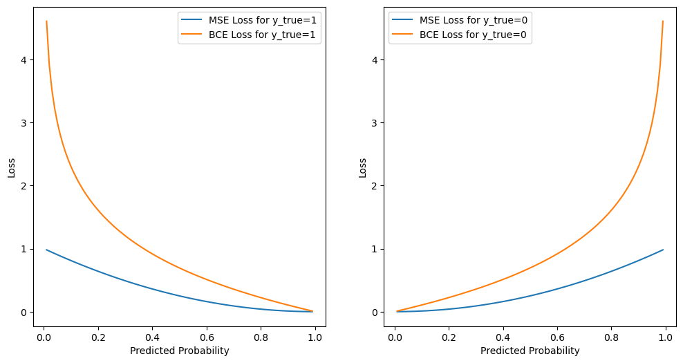
We can see that the cross-entropy loss function penalizes the model more when the predicted probability is far from the true label. For example, if the true label is 1 and the model predicts 0.01 probability of class 1, the cross-entropy loss is 4.6, but the mean squared error loss is 0.99.
Optimization#
Our loss function is
We arrive at the following minimization problem:
There is no closed-form solution for the minimization problem, so we need to use optimization algorithms to find the optimal parameters \(\mathbf{\beta}\).
Prediction and Performance Metrics#
After we find the optimal parameters \(\mathbf{\beta}\), we can use the model to make predictions. The output of the model is the probability of the input belonging to class 1. Therefore, if the output is greater than 0.5, we predict class 1, otherwise we predict class 0.
Accuracy is the most common metric for classification problems. It is defined as the number of correct predictions divided by the total number of predictions.
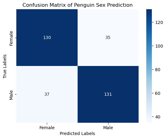
Alternatively, we can use the confusion matrix to evaluate the performance of the model. The confusion matrix is a table that shows the number of true positives, true negatives, false positives, and false negatives.
import matplotlib.pyplot as plt
import numpy as np
from sklearn.linear_model import LinearRegression, LogisticRegression

def sigmoid(z):
    return 1 / (1 + np.exp(-z))

# Set seed for reproducibility
np.random.seed(0)

# Generate a toy dataset
N = 5
x_class1 = np.random.normal(2, 1, N)
x_class2 = np.random.normal(0, 1, N)

y_class1 = np.ones(N)
y_class2 = np.zeros(N)


# Features and labels, with and without outlier
X = np.concatenate((x_class1, x_class2)).reshape(-1, 1)
y = np.concatenate((y_class1, y_class2))

# Fit linear regression
ols = LinearRegression()
ols.fit(X, y)

# Fit logistic regression
clf = LogisticRegression()
clf.fit(X, y)

# Generate test data for plotting
X_test = np.linspace(-5, 10, 300).reshape(-1, 1)
y_test = ols.predict(X_test)
logistic_prob = sigmoid(clf.coef_ * X_test + clf.intercept_)

# Plotting
plt.figure(figsize=(10, 5))

# plot data
plt.scatter(x_class1, y_class1, label='Class 1', marker='x', color='k')
plt.scatter(x_class2, y_class2, label='Class 2', marker='o', color='k')

# Without extra points
plt.plot(X_test, y_test, label="Linear Regression", linewidth=2)
plt.plot(X_test, logistic_prob, label="Logistic Regression", linewidth=2)


plt.title("Comparison of Regression Models")
plt.axhline(0.5, color=".5")
plt.ylabel("y")
plt.xlabel("X")
plt.yticks([0, 0.5, 1])
plt.ylim(-0.25, 1.25)
plt.legend(loc="upper left", fontsize="small")
plt.tight_layout()
plt.show()
Poll#
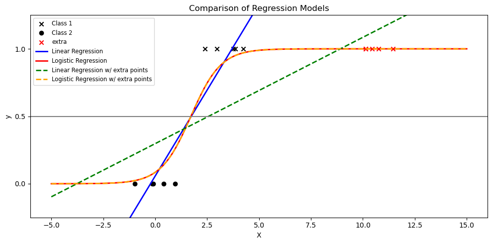
If we have some additional samples of class1 near 10. Which of the following statements is true?
import matplotlib.pyplot as plt
import numpy as np
from sklearn.linear_model import LinearRegression, LogisticRegression

def sigmoid(z):
    return 1 / (1 + np.exp(-z))

# Set seed for reproducibility
np.random.seed(0)

# Generate a toy dataset
N = 5
x_class1 = np.random.normal(2, 1, N)
x_class2 = np.random.normal(0, 1, N)

y_class1 = np.ones(N)
y_class2 = np.zeros(N)

# Include outlier
n = 5
x_extra = np.array([10]) + np.random.normal(0, 1, n)
y_extra = np.ones(n)


# Features and labels, with and without outlier
X = np.concatenate((x_class1, x_class2)).reshape(-1, 1)
y = np.concatenate((y_class1, y_class2))

X_with_extra = np.vstack([X, x_extra.reshape(-1, 1)])
y_with_extra = np.concatenate([y, y_extra])

# Fit linear regression
ols = LinearRegression()
ols.fit(X, y)
ols_with_extra = LinearRegression()
ols_with_extra.fit(X_with_extra, y_with_extra)

# Fit logistic regression
clf = LogisticRegression()
clf.fit(X, y)
clf_with_extra = LogisticRegression()
clf_with_extra.fit(X_with_extra, y_with_extra)

# Generate test data for plotting
X_test = np.linspace(-5, 15, 300).reshape(-1, 1)
y_test = ols.predict(X_test)
y_test_with_extra = ols_with_extra.predict(X_test)
logistic_prob = sigmoid(clf.coef_ * X_test + clf.intercept_)
logistic_prob_with_extra = sigmoid(clf_with_extra.coef_ * X_test + clf_with_extra.intercept_)

# Plotting
plt.figure(figsize=(10, 5))

# plot data
plt.scatter(x_class1, y_class1, label='Class 1', marker='x', color='k')
plt.scatter(x_class2, y_class2, label='Class 2', marker='o', color='k')
plt.scatter(x_extra, y_extra, color='red', label="extra", marker='x')

# Without extra points
plt.plot(X_test, y_test, label="Linear Regression", linewidth=2, color='blue')
plt.plot(X_test, logistic_prob, label="Logistic Regression", linewidth=2, color='red')

# With extra points
# plt.scatter(X_with_extra, y_with_extra, label="Data w/ Outlier", color="black", alpha=0.5, zorder=20)
plt.plot(X_test, y_test_with_extra, label="Linear Regression w/ extra points", linestyle='--', linewidth=2, color='green')
plt.plot(X_test, logistic_prob_with_extra, label="Logistic Regression w/ extra points", linestyle='--', linewidth=2, color='orange')

plt.title("Comparison of Regression Models")
plt.axhline(0.5, color=".5")
plt.ylabel("y")
plt.xlabel("X")
plt.yticks([0, 0.5, 1])
plt.ylim(-0.25, 1.25)
plt.legend(loc="upper left", fontsize="small")
plt.tight_layout()
plt.show()
import matplotlib.pyplot as plt
import numpy as np
from sklearn.linear_model import LogisticRegression
from sklearn.inspection import DecisionBoundaryDisplay

# Set random seed for reproducibility
np.random.seed(0)

# Number of samples per class
N = 100

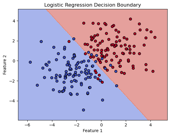
# Generate data: class 1 centered at (2, 2), class 2 centered at (-2, -2)
x_class1 = np.random.multivariate_normal([1, 1], 2*np.eye(2), N)
x_class2 = np.random.multivariate_normal([-2, -1], 2*np.eye(2), N)

# Combine into a single dataset
X = np.vstack((x_class1, x_class2))
y = np.concatenate((np.ones(N), np.zeros(N)))

# Create a logistic regression classifier
clf = LogisticRegression()
clf.fit(X, y)

# Plot the decision boundaries using DecisionBoundaryDisplay
fig, ax = plt.subplots()
db_display = DecisionBoundaryDisplay.from_estimator(
    clf,
    X,
    grid_resolution=200,
    response_method="predict",  # Can be "predict_proba" for probability contours
    cmap='coolwarm',
    alpha=0.5,
    ax=ax
)
# Scatter plot of the data points
scatter = ax.scatter(X[:, 0], X[:, 1], c=y, edgecolors='k', cmap='coolwarm')

# Adding title and labels
ax.set_title('Logistic Regression Decision Boundary')
ax.set_xlabel('Feature 1')
ax.set_ylabel('Feature 2')
Text(0, 0.5, 'Feature 2')
Binary Classification using penguins dataset#
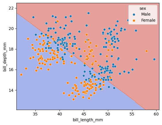
In this part, we will use 2 features to predict the sex of the penguins and visualize the decision boundary.
import pandas as pd
import seaborn as sns
from sklearn.model_selection import train_test_split
from sklearn.linear_model import LogisticRegression
import matplotlib.pyplot as plt
from sklearn.preprocessing import StandardScaler


# Load the dataset
df = sns.load_dataset('penguins')

# Drop rows with missing values
df.dropna(subset=['sex', 'bill_length_mm', 'bill_depth_mm'], inplace=True)

# Use features to predict sex
features = ['bill_length_mm', 'bill_depth_mm']

# Select features
X = df[features]
y = df['sex']

# Initialize and train the logistic regression model
clf = LogisticRegression(penalty=None)
clf.fit(X, y)

# prediction
y_pred = clf.predict(X)

# Calculate the training and test accuracy
score = clf.score(X, y)
print(f"Training accuracy: {score:.2f}")
Training accuracy: 0.78
clf.classes_
array(['Female', 'Male'], dtype=object)
y_pred[:5]
array(['Male', 'Female', 'Female', 'Female', 'Male'], dtype=object)
clf.predict_proba(X)[:5]
array([[0.49992132, 0.50007868],
       [0.70860573, 0.29139427],
       [0.55266441, 0.44733559],
       [0.54734163, 0.45265837],
       [0.18061042, 0.81938958]])
import seaborn as sns
# Plot the decision boundaries using DecisionBoundaryDisplay
fig, ax = plt.subplots()
db_display = DecisionBoundaryDisplay.from_estimator(
    clf,
    X,
    grid_resolution=200,
    response_method="predict",  # Can be "predict_proba" for probability contours
    cmap='coolwarm',
    alpha=0.5,
    ax=ax
)
# Scatter plot of the data points
scatter = sns.scatterplot(data=df, x=df[features[0]], y=df[features[1]], hue='sex')
from sklearn.metrics import confusion_matrix

# Predict on the test set
y_pred = clf.predict(X)

# Evaluate the model
conf_matrix = confusion_matrix(y, y_pred)
print("Confusion Matrix:\n", conf_matrix)

# Plotting the confusion matrix
sns.heatmap(conf_matrix, annot=True, fmt='d', cmap='Blues', xticklabels=clf.classes_, yticklabels=clf.classes_)
plt.xlabel('Predicted Labels')
plt.ylabel('True Labels')
plt.title('Confusion Matrix of Penguin Sex Prediction')
plt.show()
Confusion Matrix:
 [[130  35]
 [ 37 131]]
