Polynomial Regression#
Given an input \(x\in\mathbb{R}\), we can create other features such as \(x^2\), \(x^3\) … \(x^p\), etc.
We can fit a polynomial of degree \(p\) to the data:
This is sometimes called a polynomial regression, but it is still a linear regression: as we are seeking a linear combination of the polynomial features. The design matrix is:
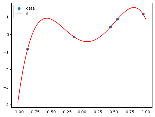
Note that if we have \((x_0, y_0)\), \((x_1, y_1)\), …, \((x_n, y_n)\), and the \(x_i\)’s are different, then there is always a polynomial of degree \(n\) that passes through all the points. In this case, the design matrix is a square invertible matrix, and therefore \(X\beta = y\) has a unique solution. This is called interpolation.
import numpy as np
from sklearn import linear_model
import matplotlib.pyplot as plt
import pandas as pd
# fix random seed for reproducibility
np.random.seed(7)
# Suppose the true model is a linear model of x

N = 5
X = np.random.uniform(-1,1,N)
Y = X + np.random.normal(0,0.1,N)

X = X.reshape(-1,1)
lreg_sklearn = linear_model.LinearRegression()
lreg_sklearn.fit(X,Y)


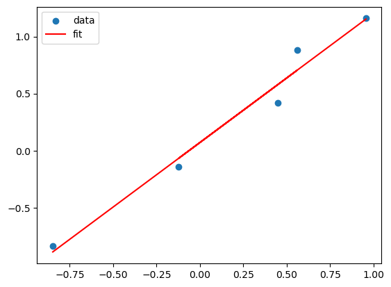
plt.scatter(X,Y)
plt.plot(X, lreg_sklearn.predict(X), color='red')
plt.legend(['data', 'fit'])
<matplotlib.legend.Legend at 0x1943ae180>

X_poly = np.hstack((X,X**2,X**3,X**4))
lreg_sklearn.fit(X_poly,Y)
lreg_sklearn.score(X_poly,Y)


print(lreg_sklearn.coef_, lreg_sklearn.intercept_)
x_grid = np.linspace(-1,1,100)
y_grid = lreg_sklearn.coef_[0]*x_grid + lreg_sklearn.coef_[1]*x_grid**2 + lreg_sklearn.coef_[2]*x_grid**3 + lreg_sklearn.coef_[3]*x_grid**4 + lreg_sklearn.intercept_
plt.scatter(X,Y)
plt.plot(x_grid, y_grid, color='red')
plt.legend(['data', 'fit'])
[-1.1329286 6.40789176 3.50868941 -7.55811971] -0.3673693141494314
<matplotlib.legend.Legend at 0x19421fe00>

This polynomial can fit all the data! But is it a good fit?
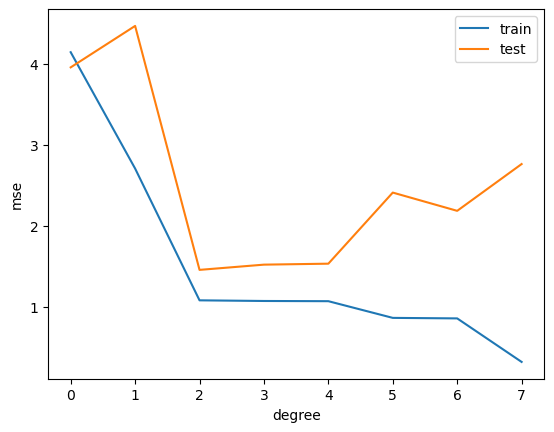
This is called overfitting. We can add more and more features to fit the data, but this might not generalize well to new data.
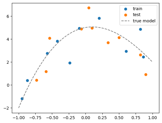
To show this, we split the dataset into a training set and a test set. We fit the model on the training set and evaluate it on the test set.
from sklearn.model_selection import train_test_split

# generate N data, this is the whole population
N = 20
x = np.random.uniform(-1,1,N)
Y = x + np.random.normal(0,0.1,N)
x = x.reshape(-1,1)


# maximum degree of the polynomial
degree = 7

# create a dataframe of all the polynomial features
X = np.hstack([x**i for i in range(degree+1)])

# convert to a pandas dataframe
df = pd.DataFrame(X, columns=['x%d'%i for i in range(degree+1)])
df.head()

# suppose the true model is a polynomial of degree 3
coeff = [5, 1, -5, 1]
df['y_true'] = sum([c*df[f'x{i}'] for i,c in enumerate(coeff)])

# add some noise to get data
df['y'] = df['y_true'] + np.random.normal(0,1,N)

# split the data into training and test sets
df_train = df.iloc[:int(N/2)]
df_test = df.iloc[int(N/2):]

# visualize the data
plt.scatter(df_train['x1'], df_train['y'])
plt.scatter(df_test['x1'], df_test['y'])
# plot the true model
x_grid = np.linspace(-1,1,100)
y_grid = sum([c*x_grid**i for i,c in enumerate(coeff)])
plt.plot(x_grid, y_grid, color='gray', linestyle='--')
plt.legend(['train', 'test','true model'])
<matplotlib.legend.Legend at 0x1944e36b0>

# For plotting, we need to create a grid of x values and its corresponding polynomial features
x_grid = np.linspace(-1,1,100).reshape(-1,1)
X_grid = np.hstack([x_grid**i for i in range(degree+1)])
df_grid = pd.DataFrame(X_grid, columns=['x%d'%i for i in range(degree+1)])
df_grid.head()
| x0 | x1 | x2 | x3 | x4 | x5 | x6 | x7 | |
|---|---|---|---|---|---|---|---|---|
| 0 | 1.0 | -1.000000 | 1.000000 | -1.000000 | 1.000000 | -1.000000 | 1.000000 | -1.000000 |
| 1 | 1.0 | -0.979798 | 0.960004 | -0.940610 | 0.921608 | -0.902989 | 0.884747 | -0.866874 |
| 2 | 1.0 | -0.959596 | 0.920824 | -0.883619 | 0.847918 | -0.813658 | 0.780783 | -0.749236 |
| 3 | 1.0 | -0.939394 | 0.882461 | -0.828978 | 0.778737 | -0.731541 | 0.687205 | -0.645557 |
| 4 | 1.0 | -0.919192 | 0.844914 | -0.776638 | 0.713879 | -0.656192 | 0.603166 | -0.554426 |
# for each degree, fit a polynomial model
from sklearn.metrics import mean_squared_error

# our features already include the constant term
lreg = linear_model.LinearRegression(fit_intercept=False)

train_mse = []
test_mse = []

fig, axs = plt.subplots(degree+1, 1, figsize=(5,degree*5))

# fit a polynomial model for each degree
for d in range(degree+1):

    # fit the model
    Xtrain_poly = df_train.iloc[:,:d+1]
    Xtest_poly = df_test.iloc[:,:d+1]

    lreg.fit(Xtrain_poly, df_train['y'])

    # calculate the MSE on training and test sets
    train_mse.append(mean_squared_error(df_train['y'], lreg.predict(Xtrain_poly)))
    test_mse.append(mean_squared_error(df_test['y'], lreg.predict(Xtest_poly)))

    # visualize the fit
    y_grid = lreg.predict(df_grid.iloc[:,:d+1])
    axs[d].plot(x_grid, y_grid)
    axs[d].scatter(df_train['x1'], df_train['y'])
    axs[d].scatter(df_test['x1'], df_test['y'])
    axs[d].set_title('degree = %d'%d)
    # show legend and MSE
    axs[d].legend(['fit', f'train mse = {train_mse[-1]:.2f}', f'test mse = {test_mse[-1]:.2f}'])
    axs[d].set_ylim(-8,8)

plt.plot(range(degree+1), train_mse)
plt.plot(range(degree+1), test_mse)
plt.legend(['train', 'test'])
plt.xticks(range(degree+1))
plt.xlabel('degree')
plt.ylabel('mse')
Text(0, 0.5, 'mse')
